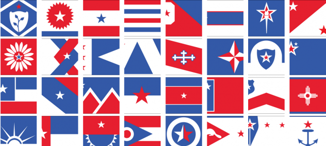

The folks over at Wired are highlighting one designer’s precious little effort to redesign the entire swathe of American state flags in order to achieve more unity and hope and other somesuch. You can see his “United We Stand” project and the relevant flag redesigns here, in all their blocky web 3.0 glory.
Why would he do such a thing – sweeping away the history of the fifty states, and the various reasons behind their flags, without so much as a by your leave?
A few months back, Ed Mitchell, a designer at the Philadelphia-based product design firm Bresslergroup, was listening to an episode of the podcast 99% Invisible dedicated to local flags, and it got him thinking about the banners we fly for our 50 states. “I was immediately bothered by how discordant they are as a group.” he remembers, “And I wasn’t surprised to learn they break just about every rule of flag design.” So, amidst the backdrop of a fractious, fighting Congress, Mitchell decided to come up with a single visual language that could be used to redesign the whole lot, all in the name of making our Union a little more, um, united…
Mitchell’s first move was to strip away “everything that reminded me of a divided nation,” he writes. All the Confederate-related stars and bars had to go. He took up some new symbols: the star and the stripe, for obvious reasons, along with the eagle, the olive branch, the shield, and Lady Liberty… The resulting 50 flags certainly do operate as a cohesive whole. Some flags, like Colorado and New Mexico, retained their general appearance, just getting a makeover with more patriotic colors. Others saw total symbolic overhauls: Mitchell’s flag for Kansas, for example, shows two interlaced arrows–one red, one blue–centered around a white star. “The intertwined arrows represent the joining of the frontiersman and the statesman who are shaking hands on the existing state seal,” he writes. Plus, the arrows echo the general shape of a “K.” Maryland’s current flag is a visually chaotic juxtaposition of the coats of arms of two of the state’s founding families.
Of course, Mitchell’s ignorance of history leads him to make a few mistakes in his sweeping away of historical symbols. His new Delaware state flag is very reminiscent of the Arkansas state flag, which was in turn a deliberate aesthetic recall of the Confederate battle flag. He writes of his Texas design: “The current flag is iconic and doesn’t need to be changed, but because this is a side project I thought it would be fun to conceptually emphasize the lone star on their flag. The goal is to make it even more iconic by enlarging the star.” Ahem. And this. And also this.
The real problem with Mitchell’s approach isn’t just that it shreds history in favor of blocky patchwork designs — such as trading the iconic indigo South Carolina palmetto, tied through with Moultrie and Eliza Pinckney, for this — it’s that it gets rid of anything particularly interesting about state history in favor of a bland and false universalism, which ignores the unique history of each state in favor of something that could really be any state, anywhere.
If you don’t believe me, look to Virginia. Virginia’s flag is just the state seal, designed by George Mason, Richard Henry Lee, and George Wythe, among others. It features an image of a female figure of the Roman deity Virtus, bare-breasted, in a pose of victory — spear point against the ground, foot on the neck of Tyranny (Great Britain), who, clad like a fallen Caesar, holds in his hand the limp whip symbolizing the Intolerable Acts. Underneath, the state motto: Sic Semper Tyrannis. This is a seal that has it all: revolutionary violence, death of the monarchy, radical feminism, casual nudity, spears and whips — and the founders approved it!
And what does Mitchell offer instead?
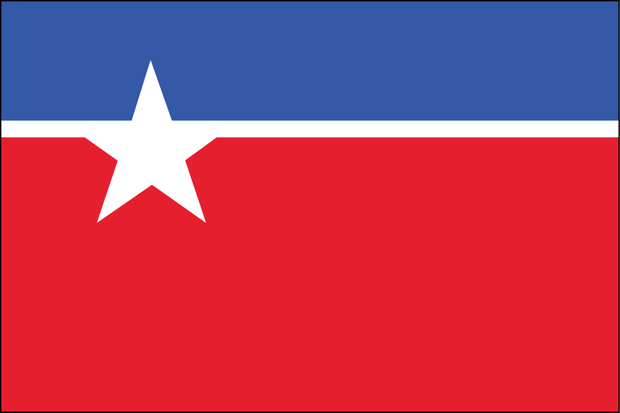
What the hell is this crap? It could be the logo for the District of Columbia’s second best street sweeper company. It has the personality and history and sex appeal of a moist head of iceberg lettuce. More design sense and effort goes into designing the fake logos for team helmets in Madden (you go, Mexico City Conquistadors). Kill this with fire.
Alan Jacobs has more. Personally, I think it’s time we had a national conversation about out -of -control designers and their obsession with the new over the tried and true. Seriously, folks: put down the Photoshop, and nobody has to get hurt.


.svg)