As the Second World War came to a rumbling close, the architects gazed out upon a shattered Europe utterly convinced of a series of new things: First, they, the architects, are in charge of architecture, and the only valid experts on the aesthetics of architecture. Therefore, the public and its leaders, who every day must view and live among their work, have no opinion that counts.
Elites as judge, jury, and, ultimately, executioner. Sound familiar? It’s all over the art world and much of politics. But recent moves in Washington might finally end the tyranny of high-minded ugliness that rules federal architecture.
An executive order drafted for the president’s signature is simply called Make Federal Buildings Beautiful Again. Although it remains at great risk of being torpedoed until the moment Donald Trump signs it, this order would do more than any move in recent history to undo the 1960s and ’70s blight every person passing through a major city is subjected to.
Buildings like the J. Edgar Hoover FBI building…

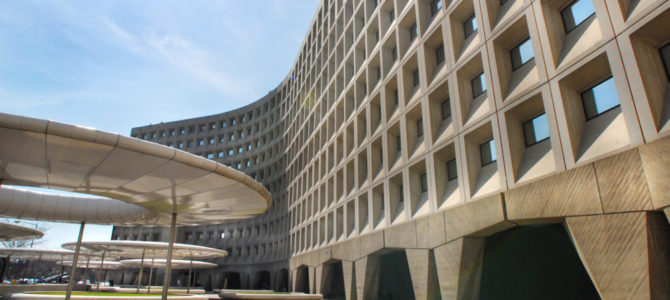
…the Department of Health and Human Services…

…and the Oregon Federal Courthouse, whose architect reportedly created guillotine shapes over the benches the public is expected to sit in.

It wasn’t always like this. For the first 150 years of the republic, the executive order reads, “America’s Federal architecture produced beautiful and beloved buildings.” The traditional buildings of our capital city, “built to endure for centuries, have become an important part of our civic life.”
And in 1901, the Department of the Treasury, which then oversaw federal architecture, issued an order that required classical architecture “for all [government] buildings as far as it was practicable to do so,” adding that, “The experience of centuries has demonstrated that no form of architecture is so pleasing to the great mass of mankind as the classic, or some modified form of the classic.”
But then in 1962, it was all undone by the Guiding Principles for Federal Architecture, an order that enshrined the new architectural elite’s belief that it is they who rule the people and their government. “The development of an official style must be avoided,” it decrees, undoing Pierre L’Enfant’s careful plan for Washington. “Design must flow from the architectural profession to the government, and not vice versa.”
Since that day, architects, untethered from the responsibility of designing buildings that the people like to see, live in and work in, have relentlessly force-fed the public ugliness. Shall we take a tour?
Begun in 1965, the Housing and Urban Development (HUD) building deserves special, bipartisan note.”With its ‘brutalist’ architecture and exposed concrete… the building itself is among the most reviled in all of Washington, and with good reason,” Obama HUD Secretary Shaun Donovan told incoming interns on their way to serve the public. Years earlier, Republican HUD Secretary Jack Kemp compared it to “10 floors of basement.”

The East Wing of the National Gallery of Art is another example. Construction of the modernist East Wing was begun in the 1970s, adding to the stunning West Wing, built in the 1930s.
The Washington Post’s former architecture critic held up the differences between the two wings as “an example of why we need contemporary thought in architecture,” which is hysterical because the modern wing’s shoddy construction cost taxpayers and donors nearly $70 million in renovations and rebuilds just 40 years after it was built.

Across the mall, sits the Museum of the American Indian. Dedicated in 2004, its bewildering and curvaceous walls are a demonstration of how not to use stone in construction.

The National Air and Space Museum is next door. Less than 40 years after it first opened its doors, its terrible construction led to what one reporter called “a stunning number of problems facing the building.” It is currently undergoing a $365 million renovation and reconstruction to fix broken systems, collapsing marble, and its “glass curtain wall[, which] allows in too much UV radiation” and is damaging historic exhibits.

Behind that, architect Frank Gehry is near completing a monument to himself under the auspices of honoring Gen. Dwight D. Eisenhower. The U.S. Department of Education, just behind the memorial, is so ugly even Ghery felt compelled to conceal its facade by erecting somehow-uglier six-story posts with steel screens stretched between them.

The derivative, modernist elevator-lobby called the U.S. Institute for Peace; the brutalist Department of Energy complex; the Kennedy Center in all its thoroughly numbing banality. The list of what architects, in their vanity, have subjected us to goes on and on.
None of these buildings are defensible. The American people are correct in their documented contempt for them, and for the architects who design and defend them.
Compare any of the above federal buildings to the U.S. Capitol, Supreme Court, the White House, the Washington Monument, the Smithsonian Castle, the Library of Congress, the Lincoln, the Jefferson. There’s no need to include their pictures because we know what all or most of them look like. Built in the city conceived by George Washington, they are its symbols, firmly established in our hearts and minds from when we were children hoping to someday visit.
Play a game and pick the best modernist building. Now compare it to your choice of the worst classical building. This sort of comparison is not merely rhetorical: It’s the landscape and symbols of our country, and it is the very comparison that people make as they tour their nation’s capital. Indeed, it is the very kind of comparison that architects believe we are not capable of making. They, of course, are mistaken.
There is good reason to believe that Sen. Daniel Patrick Moynihan, who was behind the General Guidelines, would condemn their result today. Moynihan had classicist sympathies, and advocated for the classical-if-derivative Ronald Reagan Building. “Twentieth Century America has seen a steady, persistent decline in the visual and emotional power of its public buildings,” he lamented just eight years after his ’62 guidelines, “and this has been accompanied by a not less persistent decline in the authority of its public order.”
So how has it been perverted? While the Guiding Principles declared federal architecture “must provide visual testimony to the dignity, enterprise, vigor, and stability of the American government,” the architects those guidelines place in complete control decided that stability means sustainability, and words like democratic and transparent can be used to justify whatever they fancy. Is the American Institute of Architects, City Journal asks, “using the word ‘democratic’ as cover for its elitist architectural pieties?”
“‘Transparency,’ for example,” Catesby Leigh continued, “would appear to serve as specious justification for the glassy buildings that modernist architects like to build but that don’t necessarily make sense in practical, let alone symbolic, terms.”
Architects of Ugliness Are Of Course Angry
These very modern architects, of course, up in arms about the order, decrying the White House team for daring to question their wisdom. The Washington Post’s architecture critic is just mortified the public or their government should weigh in on their public architecture: “We’ve seen how people with thin resumes and overweening ambition can insert themselves into institutional chaos,” he writes, “and prevail by turning up the volume until all the quiet, sober, serious professionals leave in disgust.”
Tellingly, his oped also defends the beauty of the East Wing and Air and Space Museum. That’s not shocking: When a Dutch architecture firm upset decent people everywhere by trying to build an obvious ode to the exploding Twin Towers, this same critic informed his readers they just don’t understand architecture, and derided the “larger cultural effort to make the events of September 11, 2001 somehow sacred.”

The firm, for its part, denied that ghoulish intent because they really do think we’re stupid.
Amazingly, this dismissal of tragedy is not an isolated feeling in modern architecture. Thom Mayne, who’s designed three federal buildings in the past three years and consulted on the Sept. 11 Memorial, actually told an interviewer on the project, “I have no empathy; it doesn’t make me weep. I could make a better case for justifying the terror than the other way around. I’m completely out of sync with America.”
This is the same fellow who in 2005, The New York Times called “the government’s favorite architect.”
Mayne also famously designed this building, meant to be a federal court house for San Francisco — a city that’s notable spikes in crime demonstrate the building “has been accompanied by a not less persistent decline in the authority of its public order.”

But there’s more! Another writer tried to tie classicism to white supremacists, specifically the Nazis. No mention is made of the famed modernists who worked “feverishly” for Adolf Hitler in the hope of becoming “an official architect in the Third Reich.”
So what does this order say to deserve such a backlash? “Architectural styles –with special regard for the classical architectural style– that value beauty, respect regional architectural heritage, and command admiration by the public,” it reads, “are the preferred styles for applicable federal public buildings.”
“Where applicable,” it continues, “federal public buildings are built in a style other than a preferred architectural style … great care and consideration must be taken to choose a beautiful design that conveys the dignity, enterprise, vigor, and stability of America’s system of self-government.”
Finally, the public must be allowed to comment on designs.
Giving preference for our government’s architecture to the public over the architects, The Washington Post’s critic gasps, “is a breathtaking assault on freedom of expression, packaged as sop to members of the public who feel they aren’t regularly heard or given deference in public discourse.”
Let that sit with you a moment. Because it’s exactly how the architecture elite, laid bare, think of you.


