It’s a strange irony of the “climate change” campaign that its advocates are the ones who deny the existence of climate change—or at least, they deny the existence of climate change in the past. They stubbornly deny that global temperatures have changed in any really significant way since end of the last ice age, insisting that climate stasis is the natural norm and that it is only in the past few decades that global temperatures have begun to vary in any significant way.
I am sad to say that this kind of dogmatic climate change denial has now made its way to XKCD, a web-based comic strip created by Randall Munroe that is a favorite of science geek types and the “I Freaking Love Science” set. It is often a bit precious and smug but occasionally quite funny, and its biggest claim to fame is probably the classic one-frame gag, “Someone is wrong on the Internet.”
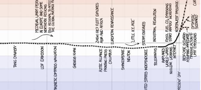
Recently, though, Munroe succumbed to climate change denial with a cartoon purporting to show a history of global temperature.
It shows a dotted line indicating the long steady upward climb in temperatures from the last ice age, from 20,000 years ago to about 11,000 years ago, when it notes that “temperatures reach modern levels.” Then the temperatures stay there, varying by less than a degree with hardly any year-to-year variation at all, up to about 1880, when the dotted line become solid—indicating (though this is not explicitly noted) that we have switched to modern thermometer measurements—at which point they begin to tick jerkily upward.
Then somewhere in the 1980s (the resolution of the graph is not very fine), everything goes haywire and the temperature graph veers sharply up toward warmer temperatures. Still, I should note, the line doesn’t actually go out of the historical range of the last 9,000 years. After that, we switch back to dotted lines that show three future “scenarios” warning of continuing rapid increases in temperature.
The idea, spelled out rather obviously to us, is that this cartoon is the ultimate rejoinder to those who say “the climate has changed before.” A cartoon, mind you. Because nothing says “I Freaking Love Science” like getting your scientific data from the funny pages. And boy did the smartest thinkers fall for it. But I digress.
The first thing a sharp-eyed observer might find odd about this cartoon is that the long dotted line of historical temperatures is smooth. Really, really smooth. Suspiciously smooth. It shows only very long, gradual changes and no year-to-year or decade-to-decade bumps and wiggles, not even on the scale of tenths of a degree. That’s weird, right? I mean, that doesn’t seem to conform to the real world or actual climate. The contrast is all the more marked when we switch to the solid line of systematic global thermometer measurements, and for the first time we start to see a little bit of that wiggly data (still smoothed out considerably by the artist, I should add).
There’s a reason for that contrast. Off in the margin of the cartoon, in tiny letters, are listed the sources for the cartoon’s data. One of them is “Marcott, et al. (2013).” Well, that rings a bell. The Marcott study is one that raised a stink because it was an attempt to create yet another “hockey stick” graph in which all of human history—this time, going back 11,000 years—shows a flat line of global temperatures, with only recent decades showing an alarming upward trend like the blade of a hockey stick. It’s a classic expression of climate change denial.
But the controversy at the time revealed a basic problem with this presentation of the data, and it has everything to do with that switch from the dotted line to the solid line. If the solid line represents thermometer measurements, what does the earlier dotted line represent? It represents estimates of global temperature based on “proxy” measurements. Because we didn’t have a systematic global set of thermometer measurements before the 1880s, scientists look at other things they can measure—sediment deposits, or tree ring growth in certain ancient, slow-growing trees—which tend to vary along with temperature. While these things don’t directly measure temperature, we can use them as “proxies” to get very rough estimates.
The problem is that these proxies tend to also vary with factors other than temperature and can be affected by things like rainfall or sheep grazing. So the temperature estimates they give us are very rough. Scientists compensate for this, in part, by “smoothing” the data. Since year-to-year spikes in the proxy data may just be noise that brings in other confounding factors, scientists average them out to get a nice smooth graph that is meaningful, not on a year-to-year or decade-to-decade level, but on a scale of centuries.
I mean that literally. When pressed on their findings, the authors of the Marcott study admitted that “the paleotemperature records used in our study have a temporal resolution of about 120 years on average.” What that means is that “no temperature variability is preserved in our reconstruction at cycles shorter than 300 years, 50% is preserved at 1,000-year time scales, and nearly all is preserved at 2,000-year periods and longer.” Get that? Any change in temperature that lasts less than 2,000 years might not be reliable.
Now we understand the strange, flat, featureless character of that dotted line. It’s not a reflection of the actual lack of variation in real temperatures. It’s a line that has been deliberately smoothed out to make up for the imperfections in the data.
I think you can also see the fundamental problem with taking that smoothed data set and just throwing it in with actual temperature measurements with all of their year-to-year and decade-to-decade variations. It makes those recent variations seem weird, dramatic, and unprecedented. But we have every reason to believe that real temperatures were varying exactly as much throughout all of the past 11,000 years. It’s just that we aren’t able to capture those variations in our measurements.
Remember that Marcott, et al., admitted that no temperature variations are preserved in their data “at cycles shorter than 300 years”—yet the entire history of thermometer measurements is less than half of that. So the “hockey stick” is an artifact of their statistical methods, its flat “handle” created by smoothing out data that is left unsmoothed in the “stick.”
Bear in mind that the supposedly crazy upward swerve in temperatures over the last 50 years or so is actually well within the overall range of temperatures from the past 11,000 years. So it’s entirely likely that this kind of variation is totally normal but is just smoothed out of the pre-1880 estimates. And the Marcott authors were forced to admit that at the time, clarifying that “the 20th century portion of our paleotemperature stack is not statistically robust” and “cannot be considered representative of global temperature changes.” In other words, their hockey stick has no blade. Yet here is XKCD, repeating exactly that mistake.
Now let’s look at the last set of dotted lines, the “scenarios” that move forward from the present. These are the only temperatures that actually veer way outside of the normal range of the past 11,000 years. But those lines don’t represent data at all. They’re not measurements of what happened. They’re somebody’s projection of what might happen. And if you’re going to present that, it might be relevant to note that current temperatures have been bumping along down at the bottom of the range of most previous projections. So not only are these just guesses about what the future might hold. There’s reason to believe they’re not very good guesses.
So we have a graph that is supposed to be an argument-ending rejoinder to the global warming skeptics. But it comes from using a misleading comparison between two very different kinds of data, and grafting them onto unreliable future predictions.
Here is a corrected, non-misleading version of the same cartoon. But the problem is the laziness of doing all of this in cartoon form, as an easy-to-digest picture for the scientifically illiterate. The problem is the facile culture of fake science fans who are gulled into proselytizing for somebody’s political agenda, and all because they want to skip out on the work of understanding where the data comes from and what it actually means, while still patting themselves on the back about how intensely they love science.
Follow Robert on Twitter.