
When superstar artists’ work manages to penetrate the popular zeitgeist, it can have the unfortunate side effect of pigeonholing their work. The name Jackson Pollock brings to mind “drip” paintings, Andy Warhol silkscreens of soup cans, and so on.
To most art lovers, a reference to Russian-American artist Mark Rothko brings to mind large rectangular canvases with deep tones that can take on a reverent, transcendent quality. But a new exhibit at the National Gallery of Art attempts to give a fuller look at his oeuvre and put his most famous work in a broader context. “Mark Rothko: Paintings on Paper” allows visitors to take a fresh look at an artist they thought they knew.
Paper Works as Mini Canvases
Giving his paper paintings their due through a dedicated exhibition seems wholly appropriate, as Rothko did not consider them inferior to his canvas works. While some artists only use paper for preliminary sketches, Rothko considered his paper creations the equal of his canvases. In their preparation — he often hung them on stretchers, with paint flowing to the edges — they can look like smaller versions of his famous canvas creations.
The more than 100 paper works in this exhibit run the length of Rothko’s career, from his early days as a struggling artist in 1930s New York to some of the last works before his tragic suicide in 1970.
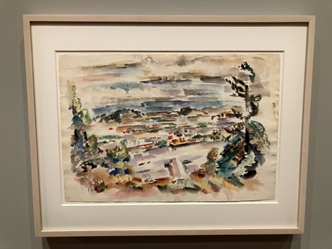
The show starts with his 1930s watercolors, which seem light years away from the works of his later career. For starters, using watercolors, as opposed to oil or acrylic, seems somehow foreign. The subjects also diverge from his later work: Some of his landscapes echo the works of Cezanne in Provence, while portraits of bathing women hearken to Degas. Even though his landscapes feature frenetic brushstrokes, they, along with the portraits, also include pools of transparent watercolor that foreshadow his future work with fields of distinct color.
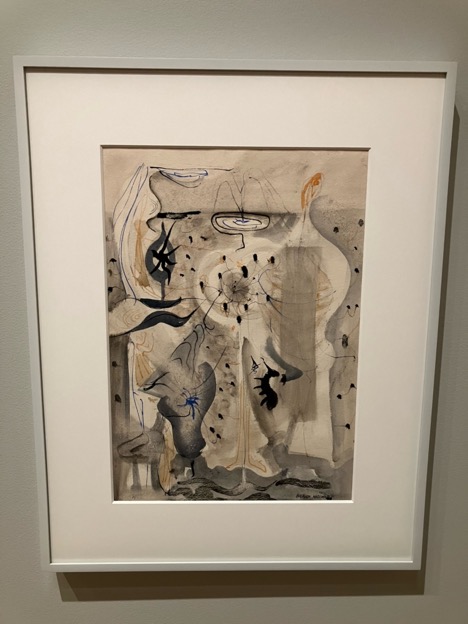
In the years following World War II, Rothko, whose Russian ancestry includes Jewish roots, tried to use his work to make sense of the horrors of war and the Holocaust. His paintings began including surreal motifs seemingly out of the works of Joan Miro, drawing squib lines in ink, or rubbing off lines of watercolor.
At this point, Rothko had his first successful show and began earning enough from the sale of his works to become a full-time artist. In 1961, Rothko included the work Baptismal Scene as among the first displayed in a retrospective at the Museum of Modern Art, signifying his belief that his career began in earnest in the late 1940s.
Broad Array of Colors
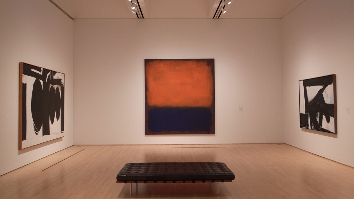
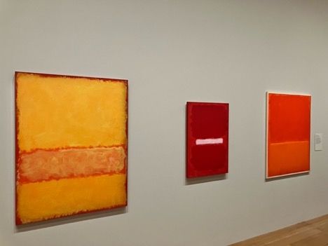
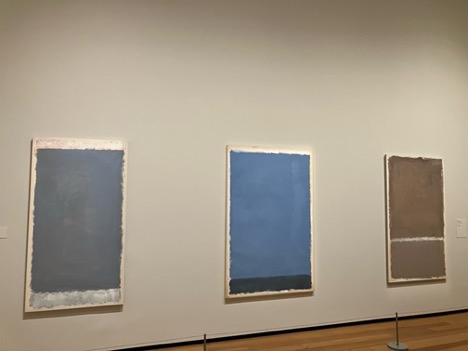
By the 1950s, Rothko developed his signature style: rectangular works featuring pooled color fields. But unlike his canvas works, which “went dark” after about 1957, Rothko’s paper creations use a broader color palette. While the canvases tend toward shades of deep maroon, green, or brown, the color fields on the paper works run the gamut.
Works featuring fields of vivid orange and yellow give a new context to a familiar paradigm. The painting’s constructs — soft rectangular fields featuring one or multiple colors — seem familiar, but the emotional effect proves altogether different. The added intimacy created by the smaller scale of most paper works — following an aortic aneurysm in 1968, his doctors forbade Rothko from painting works larger than 40 inches for a time — gives viewers the chance to compare and contrast multiple works in a single gallery.
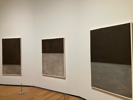
Even in his later years, Rothko continued exploring new elements in his work. In 1969, his brown and gray paintings on paper, along with his black and gray works on canvas, prompted some observers to consider the somber colors a precursor to his suicide. But in those very same months, Rothko also began experimenting with ethereal works featuring gray, pale blue, pink, and even lavender, adding small unfinished borders to his paintings to give them a unique effect.
Calm, Violent, or Just Brilliant?
The National Gallery seems an appropriate venue for the show, as it holds the largest collection of more than 1,000 Rothko works. The gallery released a published compilation of the artist’s canvas works in 1998 and is still releasing volumes of his paper works in phases.
Rothko himself disliked the stereotype that his color field paintings were “calm,” claiming that he was “the most violent of all the American painters. Beneath those colors hides the final cataclysm.” The broad scope of the National Gallery’s show demonstrates how colors play different roles to him. Some of Rothko’s darker works absorb light, and the viewers’ interest, while his brighter works — one, with an undercoat of pink, seems phosphorescent — radiate energy outward throughout the gallery.
Cataclysmic or not, “Mark Rothko: Paintings on Paper” allows viewers to see the fullness of the light he brought through his entire career.
“Mark Rothko: Paintings on Paper” is on view at the National Gallery of Art’s East Building through March 24.