
With every debate on taxing and spending in Washington comes inevitable references to which states send more in taxes to the federal treasury than they receive in benefits for their citizens. The figures thrown around are sourced differently and vary widely, but the point of it all is for Democrats to point at poor, Republican states and call them hypocrites for doing exactly what Democrats say they should: taking money from richer places.
But how much of it is true? An op-ed in The New York Times this week accuses Republicans of favoring red states over blues ones in their plans, while repeating the old lie that small states’ equal representation in the Senate favors Republicans (the ten smallest states are currently represented there by nine Republicans, nine Democrats, and two independents who caucus with the Democrats; the ten largest states are represented by nine Republicans and eleven Democrats).
What kind of spending are they talking about? And what is behind these claims, which pit one part of the population against the other?
Who Pays More Taxes?
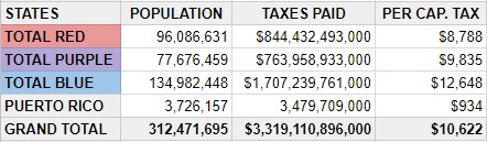
Let’s start with the taxes paid. In fiscal year 2016, the Internal Revenue Service collected a record $3.3 trillion in taxes nationwide. That money came from a total population of 312,471,695, according to the most recent census (for this article, the figures will only include the 50 states, Washington DC, and Puerto Rico). That gives us a national average of $10,622 in taxes for each American.
Even that figure is a little misleading, because the taxes collected include estate taxes, unemployment taxes, business taxes, and excises, which cannot be accurately attributed to one person. If we want to talk about individual income taxes only, the figure is a slightly lower $9,216 per person.
So do blue states pay more than red ones? Again, defining terms is important in answering the question. For this article, we’ll call states that voted for the Democratic candidate for president in 2008, 2012, and 2016 blue states. Those that voted Republican all three years are red, and those that shifted in different elections are purple.
The result: Democrats are correct on this fact. The blue states did pay more per capita in federal taxes than the red did. The $12,648 per capita taxation there is 118 percent of the national average. The purple states fell in between the two, slightly below the national average.
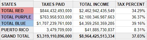
What accounts for the difference? Blue states are, on average, richer. Because we have a progressive tax system, more money comes from richer people, and if a state’s citizens are, on average, richer, they pay more into the federal fisc. The per capita income in the United States, according to the American Community Survey, is $28,889. In blue states, the figure is higher, at $32,295, which is 112 percent of the national average. The figures in the purple and red states are closer to the national average: the purple per capita income is $27,040 (94 percent of the national average) and in the red states the figure is $25,633 (89 percent of the national average).
Even with a flat tax, the rich pay more dollars of tax. The “flat” adjective refers only to the rate, so under a flat tax the rich still pay more, just not disproportionately more. But even so, the effective taxes paid in blue states are not very much higher than that of the reds and purples.
The IRS collected taxes equal to 37.03 percent of the income earned in America (again, this includes non-individual income taxes collected in a state, such as corporate tax and excises). In the blue states, the figure is a little higher: 39.16 percent. In the purples and reds, it is a little lower: 36.37 percent and 34.29 percent, respectively.
None of this is surprising. What is surprising is that Democrats often act like the red states are getting away with something. Progressive ideology has as one of its central tenets the idea that money should be transferred from the rich to the poor. In our progressive tax code, they have succeeded in enacting the first part of that equation. The only strange part is that they look askance at the poorer regions of the country for simply obeying the tax code.
Who Gets More Benefits?
How much the federal government takes in taxes is simple question. How much they pay out gets more complicated.
One way of looking at it is to see what percentage of states’ budgets are paid for by direct transfers of federal funds. That was the analysis done in a Pew Trusts report in July 2017, based on federal government data from fiscal year 2015. Intergovernmental transfers from the feds to the states include the money used to pay for programs that Washington funds but the states administer. About half goes to health-care programs; education and transportation spending also come out of these funds. They also include welfare programs, grants to local police forces, and other indirect federal spending within a state (this 2013 CBO report gives more details).
The results are somewhat at odds with the claims on the Left that the red states are takers while the blue states are makers. Of the ten states with the lowest percentage of funds coming from Washington, three are red, six are blue, and one is purple. The state with by far the lowest level of federal subsidization was the deeply red state of North Dakota. The highest ten included eight red states, but also two blue states: Oregon and New Mexico. (DC and Puerto Rico are excluded from these calculations because their relationships with the federal government are different than if they were states.)
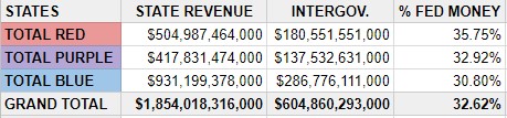
On average, the three groups were not that far apart. Against a national average of 32.62 percent federal subsidy, the blue states received 30.80 percent. Purple states were almost exactly at the national level with 32.92 percent coming from Washington. Red state budgets averaged 35.75 percent federal money. As with the taxes, there is a slight tilt to one side, but nowhere near what you would think based on complaints from the Left.
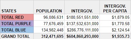
A problem with this metric is that although federal funds make up a larger percentage of red states’ state budgets, the budgets in those states are generally lower overall than those of the free-spending blue states. If, instead of comparing federal funds to state budgets, we look at how much the federal government spends in intergovernmental grants per resident of a state, the results are turned on their heads.
Against a national average of $1,935 in intergovernmental spending per American, red states receive just $1,879. Blue states get considerably more, at $2,124 per resident. Purple states see the least of their money returned to them per capita, at just $1,770. Measured in this way, the blue states are getting quite a bit more than the red or purple.
Which States Get the Most of What They Paid?
The answer to the ultimate question requires us to compare what the states pay in and what they get back. Immediately, though, we have to understand that these intergovernmental transfers—the source of most calculations about these claims—are only a fraction of what the federal government spends. In 2016, the federal budget called for $3.9 trillion in spending, of which just $604 billion was in intergovernmental transfers. All of the claims about which states take what, therefore, are based on an analysis of just 15 percent of all federal spending.
Even within that limited range of figures, the results are not the open-and-shut case that critics from the Left would have us believe. For one thing: no state receives more in intergovernmental transfers than its citizens and corporations pay in federal taxes. The state that gets the most back in intergovernmental transfers is a blue state, New Mexico, at 80.27 percent. Red states West Virginia and Mississippi are the only other two that get back more than half of their taxes in this form of spending (67.30 percent and 63.12 percent, respectively).
This tells us nothing about the politics of those places, only that they are, on average, poorer, and therefore more eligible for federal programs for their residents. Delaware receives the smallest percentage back—9.89 percent. Again, this is probably a result of the disproportionate amount of corporate and trust income taxes coming from that state, not because of the politics of their state.
What About The Rest?
Other studies claim to take in the remaining 85 percent of federal spending and divvy it up among the states. Another Pew study does that through various methods, some of which make sense, others of which are harder to justify.
Nearly two-thirds of spending, they note, goes to individuals, not to state governments or groups. That makes it more difficult to attribute to one state. If a couple from Michigan retires and spends five months each year in Florida, to which state are their Social Security checks attributed? Their legal residence may be in Grand Rapids, but it is quite possible that they spend more of their money in Tampa.
There is also the matter of military spending, a large part of the federal budget. As Pew notes, military spending is spread unevenly across the states. That is as much through accident of history—where bases are located—than because of any twenty-first-century military need.
But the confusion goes even beyond that. Many of our military bases are located overseas. On all bases and ships, the men and women serving are from states and territories around the country. Does a Marine in Guam have his paycheck attributed to that territory, or to his home state? Doesn’t defense spending benefit all Americans, no matter where the check is cashed? What does the location matter?
It matters only in so far as the politicians and pundits who cite these statistics do so in an effort to divide us. The idea of a Blue America and a Red America is a dangerous one, but it is a tempting weapon to yield for a politician who wants to rally his base. State governments like California’s use these figures to justify their own righteousness and demand that, as net “donors” to the American republic, they be given more deference, and more power. (Even in that chart, note that the top donor state is red and the top recipient is blue).
This is a common refrain from the rich to the poor throughout history: they pay for something, so they must be allowed to control it, and to control the people that receive it. Indeed, that it is so consistently demanded shows why massive spending is incompatible with a free people. As long as other people pay for you to survive, they will demand to control how you live.
Politicians love to use fuzzy statistics like these to do so, and will always find an audience for their claims. As our government continues to expand in scope and size, we should consider this another reason to resist.