
Today marks the official rollout of the Affordable Care Act, President Obama’s signature health care law. Beginning on October 1, individuals will be eligible to sign up for new health plans administered by the health care exchanges created by Obamacare. In theory, that is. Many state health exchanges are not even close to being operational.
In honor of the current administration’s complete inability to implement the law despite having more than three years to prepare for it, here are 8 charts that help explain why health care costs in have America exploded over the past several decades, and why Obamacare will do nothing to address the problem.
1. Before Medicare and Medicaid were enacted in 1965, most health spending in the U.S. was out-of-pocket, meaning that health consumers were very sensitive to the costs of their health care decisions.
2. After Medicare and Medicaid were enacted, health care spending in the U.S. skyrocketed.
3. Private insurance and Medicare/Medicaid/CHIP basically replaced out-of-pocket spending, a new dynamic which insulated the consumers of health care from the actual cost of health care. Unsurprisingly, this dynamic resulted in rapid cost growth.
4. At the same time, Americans began to live longer and longer.
5. And each extra year appears to cost even more than the previous one. In 2011, for example, each day of additional life expectancy compared to 2010 cost $1.6 billion.
6. As Americans live longer, they become more susceptible to costly diseases and ailments that are less likely to affect younger people.
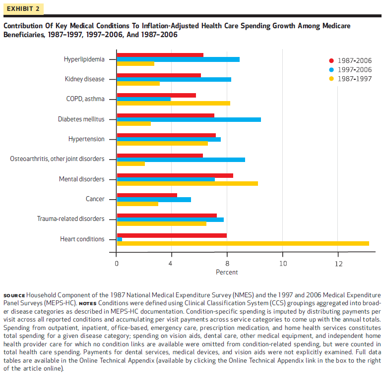
7. It turns out that end-of-life care for chronically ill individuals costs a lot of money, especially when those costs are not paid directly by the person receiving treatment. 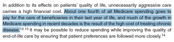
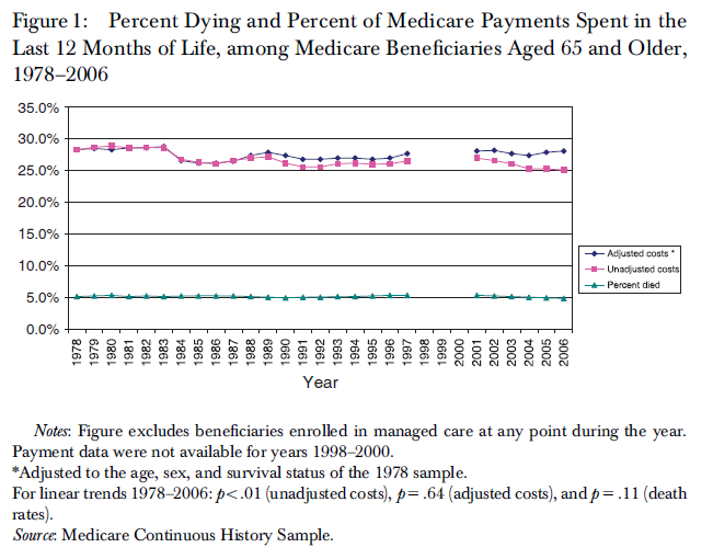
8. According to one study, nearly 30 percent of all Medicare costs in the U.S. are spent on treatment for individuals during the last 12 months of their lives. Those individuals comprise only 5 percent of all Medicare beneficiaries.
Unfortunately, Obamacare does nothing to realign the incentives of patients, health care providers, and insurers.
The individual mandate, for example, forces young and healthy individuals to subsidize older, less healthy individuals. At the same time, Obamacare prohibits those young and healthy individuals from only buying the health care they need. Instead, it forces them into costly insurance programs that may not come close to matching their needs or their affordability requirements.
Obamacare also did nothing to address the incentive problems inherent to Medicare. Despite massive technological achievements in the field of medicine that have changed how people are diagnosed and treated, Medicare has hardly changed at all. It remains a primarily fee-for-service program, in which health care providers are incentivized to provide more services in order to receive more fees. At the same time, patients are also incentivized to demand more and more services since the program insulates them from the costs of those services. The result? Higher costs.
And as shown in chart 3 above, the fee-for-service Medicare model has completely overtaken the U.S. health care system. With all that in mind, it’s no wonder that U.S. health care costs have exploded. What’s remarkable is that policymakers refuse to acknowledge and address the root cause of health care cost growth in the U.S.


