When you throw back, it is imperative that you throw the right distance. Whether it’s a Facebook photo, a baseball uniform, or a corporate logo, the throwback is trendy but execution is key.
Throw too far and you’re in danger of losing any sense of quirk or fun. You look just like every other newborn in your newborn pic. The Steelers’ notorious striped throwback uniforms look like the “No Rain” girl took a detour through the Depression era. Sad! And the Yankees’ early-twentieth-century throwbacks are, um, aren’t those just their uniforms?
Throw too short and you’re in the awkward years. Oh, be-braced middle-school band picture. This is not where you want to be. There’s a reason you don’t hear a lot of announcements about local professional sports teams’ ’90s throwback uniforms (with the notable exception of the Miami Heat’s, which meh). Don’t nobody want a neon Starter jacket and short basketball shorts.
You want to turn the clock back just the right amount— to a time when every font looked like an arcade game logo, you were riding in a Barbie Corvette wearing tall striped athletic socks, and the great questions were still unanswered— “Who shot J.R.?” and “Where’s the Beef?”
This throwback magic is the reason Keri Russell can be hotter than she’s ever been on “The Americans.” The show took it back to ’82, not ’93, where admittedly Soviet spies would have been less interesting.
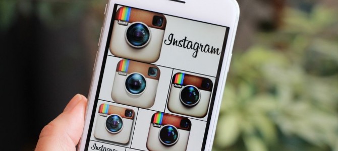
This brings me to Instagram’s new logo. When the photo-sharing app debuted as an upstart start-up, it had already executed the perfect throwback. The Instagram logo was the Keri Russell of corporate throwbacks, hitting a Houston Astros-ian level of early-’80s perfection. The brown, the Playskool-reminiscent camera design, the teeny rainbow flourish! It was a joy to look upon… while wearing a ringer tee and watching “Dynasty.”
But Instagram introduced a new logo this week, shocking its users with a simple, Apple-esque camera logo superimposed on a swirly, impressionist sunset color scheme. Many are unhappy; there’s even a hack to get the old logo back. Gone was the physicality of the retro camera and its promise of charmingly dated filters. Here was, well, a ’90s T-shirt. And what does a ’90s T-shirt portend in an app other than awkward dancing and the unflattering application of floral bodysuits.
Forthwith, the four ’90s T-shirts you owned that are cuter than the new Instagram logo:
Hypercolor
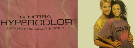
Use your index finger to flirtatiously draw a rudimentary camera shape on the chest of your high-school boyfriend’s Hypercolor T-shirt. Voila. You’ll never be able to unsee that.
Airbrushed Myrtle Beach Sunset
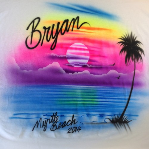
Spring Break, ’94! Tell me that’s not the exact color scheme of the new logo, straight off a roadside stand at The Strand. The blending, the vibrance! Frankly, I’m surprised anything other than an airbrush in the hands of a talented transient art-school drop-out can mimic nature to this degree.
Bartman
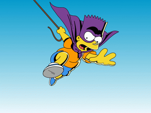
I refer of course to the seminal ’90s TV show and the alter-ego of everyone’s favorite juvenile delinquent, Bart Simpson. The yellow-orange of the Instagram logo is immediately evocative of the Simpson pallor, while the purple and red round out Bartman’s attire. Bartman brings to mind the awkward dance craze and squeaky-voiced rap of the same name—with collaboration from Michael Jackson!— whose popularity proved the Simpsons could do no wrong in their heyday. Also, that there was a heyday for extremely successful recording artists performing alongside cartoon characters. (I’m looking at you, Paula and MC Skat Cat.) It was a silly time, a fun time. But was it a stylish time?
Desert Storm Commemoration

I hate to politicize this list, but it’s worth remembering that even our patriotic T-shirt designs could not be shielded from the gauche color palette of the ’90s. When you asked your mom to spring for a “these colors don’t run” tee at Wal-Mart, the colors were neon orange and yellow, with a fighter jet in the foreground.
I’m being hard on the logo. It may not be that it’s so bad, but that its predecessor was so good that it suffers by comparison. The old Instagram logo inspired the kind of organic community engagement (buzzword alert!) that every company craves. Several years ago, Instagram users started recreating the charming retro camera with everyday objects and posting them to, well, Instagram. Synergy! (Buzzword limit reached.)
The results were silly, charming, and sometimes stunning, but they all served to reinforce users’ relationship with the app. In 2014, AdWeek noted the rarity of this in reporting on the #myinstagramlogo trend:
“You don’t hear a lot of users gushing about their social networks these days, but Instagram seems to be a noticeable exception—as illustrated by the recent trend of photographers creating artistic homages to its logo.”
Why give that up? The new logo, by contrast, is much harder to recreate (although some are trying, with some success).
It could be that Instagram is just on the cutting edge of throwing back. After all, window shopping in any major American city right now reveals an incredible appetite for Doc Martens, high-waisted jeans, and chokers. We can’t be far from floral bodysuits and Starter jackets again.
But give me hot spy Keri Russell aesthetic over Felicity, and Atari over Sega Genesis any day. If my throwback preference is behind the times, so be it.

